- Color Adjustment
- Sample Adjustments
- Browser Support
Tutorial: Color Adjustment
Pictures may be too bright, too dark, or off-color. Adjusting the HSV color space can sometimes reveal details.HSV Color space
When we look at pictures, we look at colors. And when we modify pictures, we modify colors. Even though the colors may visually look similar, there can be enough minor color differences to identify potential alterations or extract useful information.There are many different ways to represent color. Typically, colors are represented by red, green, and blue components (RGB). The RGB color space defines a cube that contains all of the colors. This represents the colors as stored and displayed by the computer. RGB is an additive color space; it is used for systems that emit colors. (If you want more red, then you emit, or add in, more red.)
The inverted RGB color space is cyan, magenta, and yellow (CMY). This subtractive color space is ideal for materials that absorb and reflect light, such as paper and fabrics. If you want an image printed on paper to appear more red, then you place more green and blue absorbing pigments (magenta and yellow), permitting only red to reflect. Printing often includes a common color called a key (K) to reduce the amount of ink necessary for printing. For example, if the key color is black, then CMYK can combine black with red to make a dark red rather than injecting a large amount of magenta and yellow.
While RGB (and by inverting, CMYK) can be used to represent any color, it actually has a distance problem. Two colors may be visually similar but geometrically distant. If you only care about storing colors, then this is a non-issue. However, if you are interested in the relationship between colors, then this is a concern.
RGB
HSV
- Hue (H). Identifies the color shading. Visually, purple and orange are both similar to red, so they are adjacent in the hue shading. In contrast, green and blue are visually different from red, so they are far from the red hue. H defines a 360° rotational angle that cycles through the rainbow.
- Saturation (S). Identifies the amount of color, from 0% to 100%. Very little color will appear pale or white, while a high saturation value indicates very intense colors. 0% is along the center axis of the HSV cone, while 100% is along the cone's edge.
- Intensity Value (V). Determines the color's brightness, from 0% to 100%; V is the distance from cone's point (0%) to the center of the widest circle (100%).
HSV's color relationships are similar to our visual interpretation. For example, really dark (nearly black) red is visually indistinguishable from really dark blue. In RGB, dark red (1,0,0) and dark blue (0,0,1) are sqrt(2)=1.414 units apart. Therefore, the colors are different. However in HSV, they are much closer together: [0°,100%,0%] to [240°,100%,0%] has a distance of 0 units ([100%,0%] to [100%,0%]) and only differ by the rotational angle (240°). Similarly, colors that are desaturated can appear to be nearly identical shades of gray, even if they are actually faintly colored.
| Name | RGB | HSV |
 |
|---|---|---|---|
| Faint Red | (255,250,250) | (0°, 2%, 100%) | |
| Faint Green | (250,255,250) | (120°, 2%, 100%) | |
| Color Distance | 7.07 units | 3.46 units | |
| Gray Red | (143,138,138) | (0°, 3.5%, 56.1%) | |
| Gray Green | (138,143,138) | (120°, 3.5%, 56.1%) | |
| Color Distance | 7.07 units | 1.94 units | |
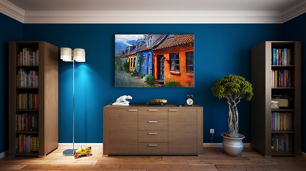
Using HSV, a color can be very intense (high saturation) and still appear dark (low V). As a visual example, consider a room with blue walls. When lit, it appears bright blue and areas in shadow appear as a darker blue. Any areas receiving almost no light appear black and indistinguishable from other very dark colors. Regardless of the lighting, the walls are still the same blue. In each case, the H and S values (that define "blue") do not change -- only the brightness intensity (V) differs.
Caveats
Color adjustments do not typically identify alterations and will not pull out fine details in every image. This analysis method is really only applicable on a case-by-case basis.- Although color adjustments may identify subtle color differences, it does not identify the cause of the difference. For example, a smudge on the camera's lens can appear as a visible blob after adjusting the colors.
- Not every web browser supports color adjustments. If your browser does not support color adjustments, then you may need to download the source picture and use a drawing program to adjust the image.
- Some drawing programs handle HSV adjustments differently. Most differences are in the scale factors and terminology. For example, the hue can be rotated 360 degrees. Both Gimp and Photoshop use a Hue range from -180° to +180°, while other systems use 0° to 360° (or 0° to 359° since 360° is the same as 0°). These are equivalent scaling systems, but they are a different numerical range. (To convert: anything above 180° should subtract 360. For example, 200° is the same as -160°.)
Similarly, Gimp calls the light intensity (V) "lightness", while other applications call it "brightness". Gimp uses saturation and lightness scales from -100 to +100 with 0 as the normal, unaltered source. Other systems use a scale from 0% to 200% with 100% being normal. Both scales are equivalent, but users need to convert values for comparison. - Some drawing programs handle HSV adjustments incorrectly. For example, Adobe Photoshop CS5 has an option to rotate the hue. The hue's color key shown by Photoshop is incorrectly rotated by 180° (if 0° is in the middle, then red should be in the middle and not to the far left). Photoshop also performs a miscalculation when adjusting the saturation, causing wildly incorrect colors.
Sample Adjustments
By adjusting the colors, differences between visually similar colors can be exaggerated. This can permit details within an image to may become easier to identify. Common adjustments include altering the hue, saturation, brightness, or inverting the colors in the picture. For example: |
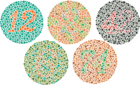
The Ishihara color test was designed to identify people with different types of color blindness. A person with full color vision should see numbers embedded in the circles (12, 2, 42, 6, and 74).
Depending on the type of color blindness, some numbers may not be visible. For example, the "74" in the last circle may appear as "71" or "21" if you have dichromatic or trichromatic color blindness, and may not be visible at all if you have achromatic color blindness. However, even with full color vision, some of these numbers may be difficult to identify. (The "2" and "6" are usually difficult.) By adjusting the colors, minor differences can become easier to see. |
 |
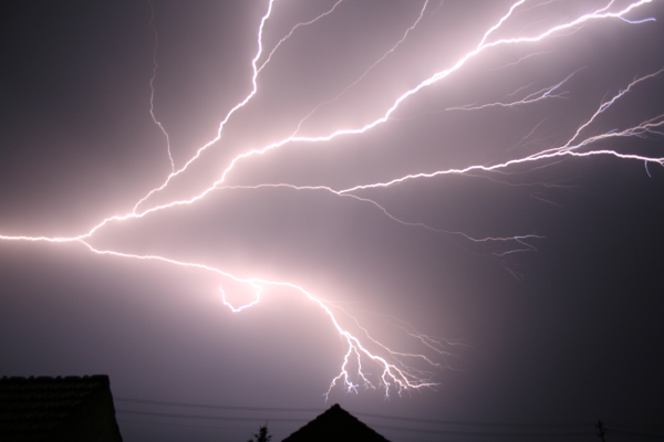
Inverting the RGB values can be particularly useful for pulling out fine details in very dark or very light images.
With the normal image, the lightning appears to be bright and blended into a bright border. By inverting the image, the core of each lightning bolt is visible as a sharp edge. |
 |
In July 2008, Iran's Sepah News released a photo showing four missiles being launched as part of a test. Close observation identified cloning (copying) of smoke within the picture. The third missile from the left was digitally added.
By altering the image coloring, you can see a faded halo in the sky around the third missile, identifying the alterated area. (Hue rotated 200°, Saturation increased to 200%, and Brightness decreased to 60%.) In this example, the altered area around the smoke is very visible by inverting the image. Altering the HSV shows the same region as a slight discoloration, but it extends around the missile. |
 |
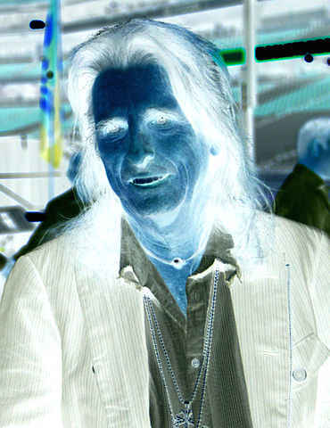
In some online forums, users may invert or alter colors in pictures. This may anonymize images or make the picture appear different. Color-altered pictures can be easily returned to their source coloring by re-inverting or rotating the hue back to normal.
When colors are altered, it can be difficult to identify what is in the image. Is the person male or female? Is the person well-known or obscure? Are there any distinct features or markings? What color is the clothing? What is in the background? By inverting the image, this example shows male musician Alice Cooper (photographed by Gage Skidmore, 2013). The inverted source obscures facial features, distorts clothing colors, and makes it difficult to identify the stadium seats in the background. |
Browser Support
FotoForensics includes an option for adjusting the image color. However, this option is not supported by all browsers. When supported, there is a button for altering the picture's color located under the list of analyzers: . Clicking on the button will bring up a menu for adjusting the hue, saturation, and brightness, as well as inverting the image.
NOTE: Browsers may only support some of this functionality. You will only see options for the functionality that your browser supports. If your browser supports none of the functionality, then you will not see the button.
Current versions of Firefox, Chrome, Safari, and Opera each support all four color adjustments (invert, rotate hue, adjust saturation, and adjust brightness). Older versions of Chrome do not support brightness adjustments. Color adjustments are not supported by Internet Explorer and most mobile web browsers.
Current versions of Firefox, Chrome, Safari, and Opera each support all four color adjustments (invert, rotate hue, adjust saturation, and adjust brightness). Older versions of Chrome do not support brightness adjustments. Color adjustments are not supported by Internet Explorer and most mobile web browsers.
Copyright 2012-2026 Hacker Factor, All Rights Reserved. • System Status • Blog • FAQ • Contact
